

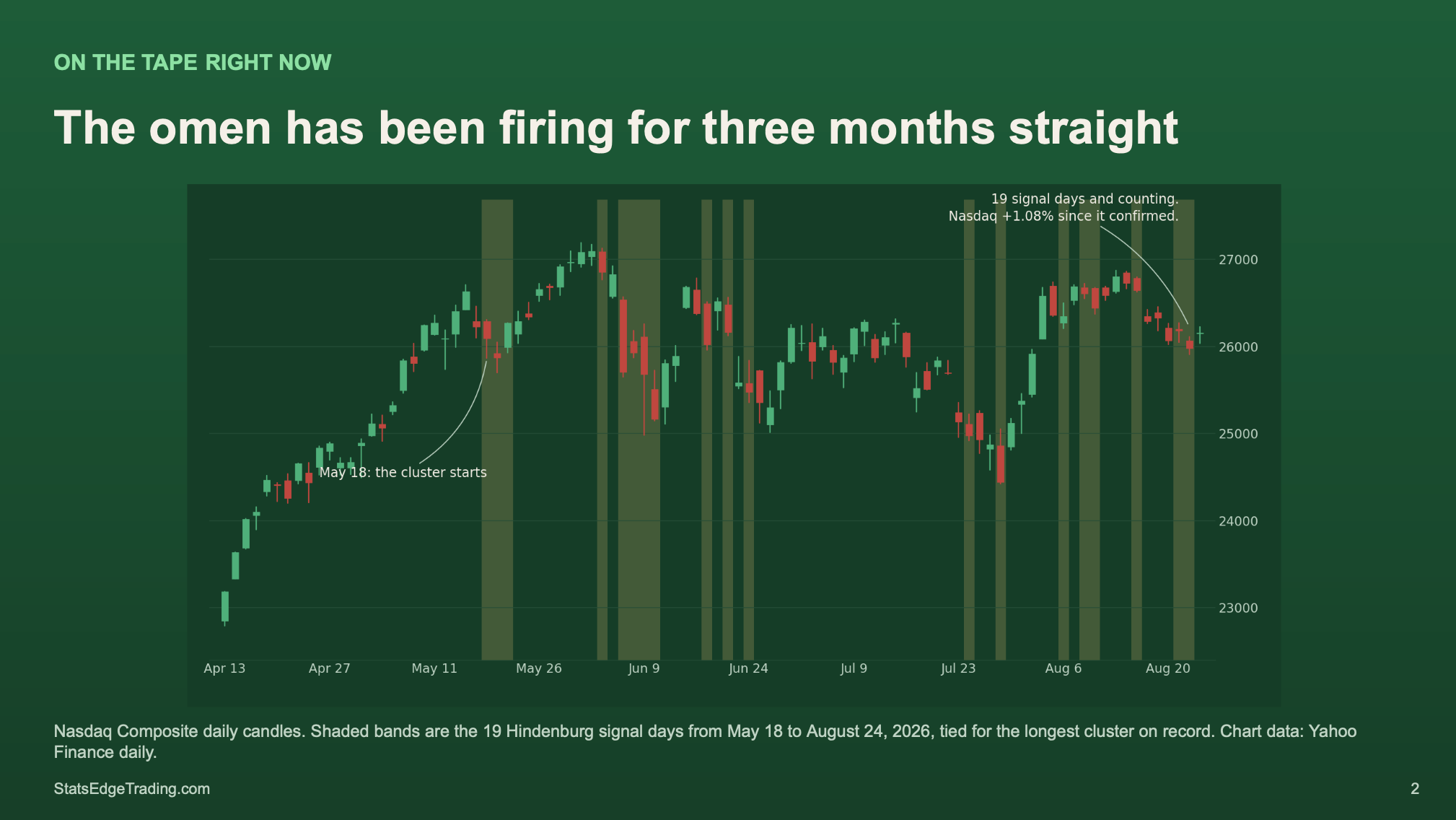
The Hindenburg Omen is back in your feed, because it just fired repeatedly. The usual chart appears, red bands marking every past signal, and the claim is that it precedes a 10% decline within 40 days about two thirds of the time.
I went back to 1931 and counted.
What it actually requires
It isn’t one indicator. Several conditions have to align: new 52-week highs and new lows expanding at the same time, meaning breadth is splitting, an uptrend still intact, and the McClellan Oscillator negative.
That’s the pitch. Stack enough conditions and you filter out the noise.
What the numbers say
Across 74 strict signals in roughly 24,000 trading days, I get about 23% for that 10% decline, not 67%. Count honestly by episode instead of resetting after every failed call and it gets worse.
But the number that matters is the baseline. Any random day carries roughly a 14% chance of the same decline. The Omen gives about 19%.
That’s not a warning. That’s noise with a marketing budget
.
Why it has a reputation
1987 is the answer. It fired before Black Monday, and a 27% collapse buys a lot of credibility. In 2010 it fired again and the market ripped.
Call three sports games correctly and people think you’re a genius. Keep calling and the data catches up.
What to use instead
The 200-day moving average. Free, no breadth data, and it does the job better. Crashes mostly don’t start above it.
The boring line beats the scary name.
Stats Edge Pro. $149.99 a month, 30-day money-back guarantee.